
I’ve always been amazed at how bad vendors are at producing decent user interfaces for vertical apps in medicine. Not that I think they’re any better in other areas, but this is the domain I’m exposed to most. The other day I got a document with requirements for a new system that the Swedish social services want made and it’s a subject of public tender. They present the requirements as a document with screenshots from a prototype app to illustrate what they want. Now, that is a spectacularly bad idea in itself, but not the subject of today’s rant, except coincidentally.
In these screenshots, and in the prototype app, they actually demonstrate one of the worst user interfaces I’ve ever seen. They invent new UI tricks, they slap on buttons and labels that make no sense and they show a workflow from hell. OTOH, I do know a vendor or two who would feel totally at home producing this crapola for them. Let me just give a few examples.
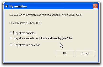
The dialog box above opens after a new application for social services has been filled in and has three radiobuttons, translated as:
The two buttons on the box are “OK” and “Cancel”.
The text that follows the illustration in the requirements document explains what should happen:
“Register application”: The application is registered/saved and the user is himself made handler for this application/incident.
“Register application and assign handler”: The application is registered/saved and the user can assign somebody else as handler, but remains responsible as long as the assignee has not accepted responsibility, except if the assignee is a manager, in which case the assignment goes through even without him accepting it.
“Do not register application”: The application is saved, but not linked to a particular applicant.
Masterful… simply masterful. Not one of the three radiobuttons actually mean what they say. I especially love the “Do not register” that actually does save the document but in a special way.
Oh, so what do you click when you don’t want to save your entries at all? “Cancel”? The close button at the top right? Who knows… nothing is said about that. Personally, I’d probably pull the plug and reboot.
Now, look at this:
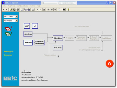
This is one of the main screens. It shows the documents in a “case”. “GU” means something special, I forgot what. “J” probably means “Journal”, which is what it sounds like. Grey documents can’t be entered. Black text, thin edge, can be created. A document with a thick blue edge has been filled in, at least partially. Thick red edge (none in this illustration) are locked. The big round red “A” button down to the right is clicked to close a “case”. Once the case is closed, all documents are locked and can’t be edited or added to. You can back out of the “A” within a certain time period; the document text suggests until midnight.
Do I need to groan for you, or do you want to handle that part yourselves?
I was planning on going through a lot more of this requirements document, but I simply can’t handle it. It’s overflowing my registers. This kind of thing goes on and on.
In conclusion, what is all this? Well, it’s a requirements document at least as bad as the worst software vendors can dump on users. Except this represents what the users actually are asking for. Except I don’t believe that. I believe it’s the IT department that likes to do prototypes. So, what should they have done?
1. Do not specify solutions in requirements documents!
2. Do stick with UI standards. Don’t ever invent your own “cute little tricks” or “big round red buttons”.
3. If you need to explain in text what a dialog text actually means, the dialog text is wrong!
If you get a document like this on your desk, you can only ask to be allowed to redo the requirements gathering. Or run screaming in the other direction. You can’t build a system like this. You will only be able to satisfy the requirements by creating junk, which they won’t pay for, or create a good app, which won’t satisfy the requirements, so they won’t pay for that either.
So, what happened? Was the application built according to these specifications, or did sanity prevail somewhere along the line? Intensely curious 🙂
I’ve always been intrigued by the software every time I visit a hospital or dentist. It looks absolutely labyrinthine.
I have no idea if it got built or not. The only thing I know is that I wasn’t involved (anymore). That keeps happening to me…