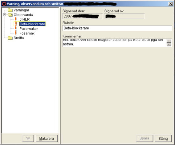
I figured I could start a series on “amazing UI” elements. Admittedly, practically all come from the multimillion electronic healthcare app I’m subjected to with frightening regularity. Just have a gander at this… note the expanse of grey to the right and the memo field with scroll bars squeezed into the upper part, with some illegible text in it. This is supposed to convey a description of an important warning about the patient. I usually try to be sanguine about it, but you really have to be retarded to design interfaces like this.